A Look into Virgil Abloh's Furniture
Virgil’s path to global accreditation in the world of design has been anything but linear. He has participated in every facet of creation, and on the highest level at that. All while being CEO of Off-White and men’s artistic director at Louis Vuitton. To most people, it’s a mystery where he finds the time for it all.
From DJing festivals at Coachella to creating concept cars with Mercedes, and designing furnishings for a Millenials apartment with furniture giant IKEA, there is nothing that’s off the table for Abloh.
Recently, Abloh has started to explore more of his furniture bag, producing a substantial volume of pieces that drastically vary from most people's idea of what furniture is, or can be.
Virgil’s appreciation for furniture comes before his designing it. When he moved out of his parent’s house for university, he commented “I had bought, which I still have, a blue Eames chair that might not go with everything else in my taste now, but I look at that as a sense of pride to live with a piece of design.”

It is interesting to hear Abloh articulate his relationship with furniture. He states that “I’m an engineer first, I make things and make them structurally sound, furniture is more my training than fashion.” Indeed, during his studies Virgil participated in woodworking and started to experiment with forms. “I was the architecture kid that was making chairs because class was so boring.”
Bringing ideas to fruition is key for Virgil. Not executing is against his nature. Also clear is that each distinct practice is deeply connected with the rest, and they all work together and feed off each other.
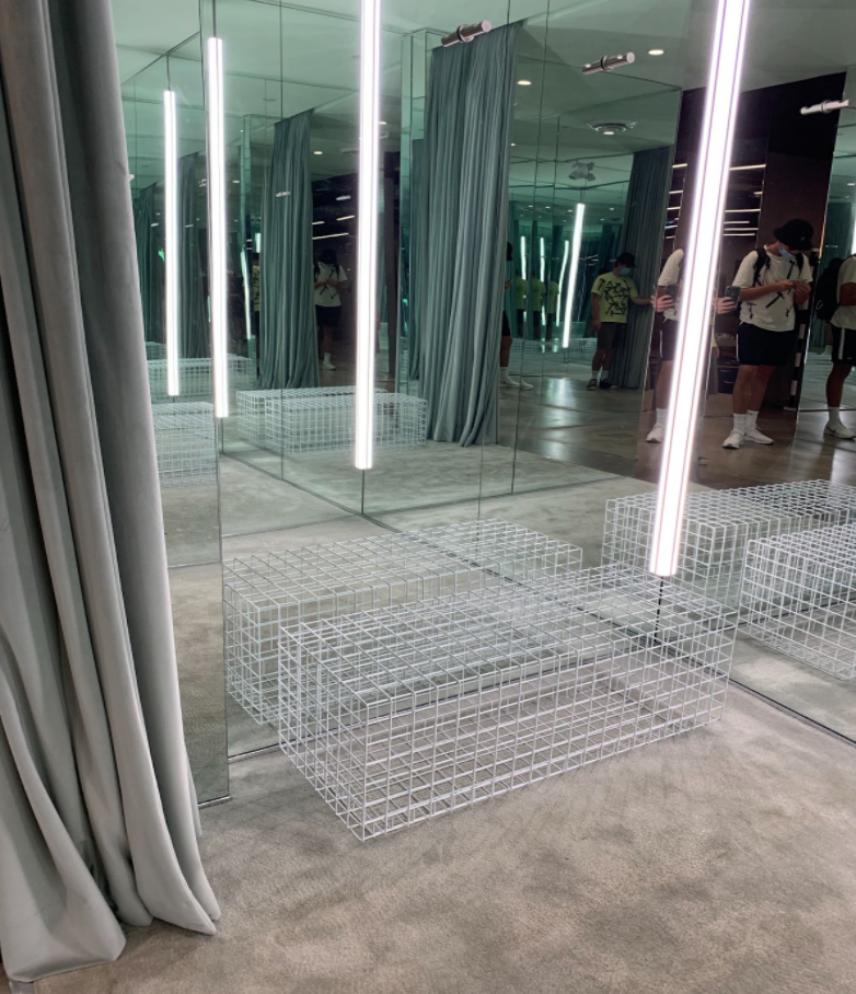
Abloh’s first true spring into furniture comes in 2014 with the launch of his “framing” collection. These pieces were made from metal arranged in a square-based mesh pattern. The idea for the symmetrical mesh comes largely from his time studying at the Illinois Institute of Technology in Chicago. The Mies van der Rohe-designed main campus, and specifically Crown Hall, were physical mentors. Mies adhered to a strict grid layout, a philosophy Virgil critically engaged with the use of the metal grid in the table and chair, creating an almost ghost-like presence in space, and seeming not to take up less space than they do in reality. The ethos behind the framing collection is based upon Virgil’s own definition of Off-White itself, occupying the intersection or grey area between two opposites. The collection is still being featured through some of his Off-White stores worldwide and serves as benches in changing rooms, as pictured, or seating options to relax and enjoy the store.
2016 was Virgil’s next major furniture exploration. Being precarious in design is something that Virgil is no stranger to. He is always trying to slightly alter one’s perception of a common object in hopes that you will be able to see through his lens. The goal isn’t to create a new object, aka being so Avant-garde that it doesn't make sense, but to modify an existing one by 3%.
The 2016 project, released at Art Basel Miami, was essentially the culmination of the Off-White ethos, with an informed knowledge in architecture. The “table'' consisted of a stack of Sheetwall drywall, branded with the word “foundation” as one leg, a large pile of rocks as the other leg and the signature metal grid as the top. It serves very little functionality as an actual table, however thats where his 3% rule mixed with the Off-White logic comes into play. The table was accompanied by cubed foam chairs, extremely simple and clean, with the ironic message “blue state chair” embossed on the top of them. In a post-election time, Virgil’s post-rationalization brought him to the conclusion that “if you’re in a blue state, you’ll buy that this is a chair.”
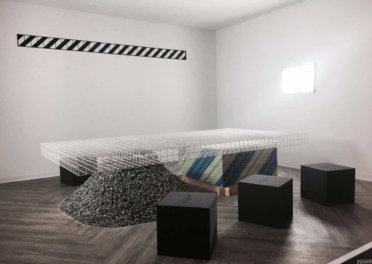
The cubes, due to their low cost, were a reminder to Abloh that as a designer, his democratic duty is to provide good design to as many people as possible and at a cost that makes it accessible. This ideology drove his next major collaboration with IKEA. The partnership was announced in 2017 and marked perhaps the most permanent and accessible showing of his design abilities to date. Even Virgil admitted that it was a dauntingly tall order to create so many pieces that will exist for so long.
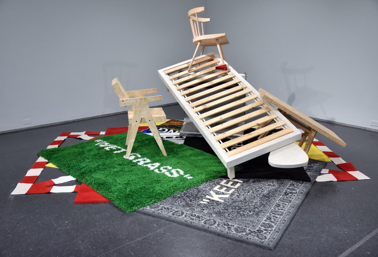
Unlike fashion which moves at a blistering pace, furniture remains relevant and intact for much longer. Notable Items from the collection included the iconic doorstop chair, a storage container, a daybed, a mirror and a table that formed as he says “the biggest design project he has ever taken on.”
Virgil geared the entire collection to rearrange people’s perceptions of everyday objects. His repetitive use of these objects, such as a nail being the handle of the storage container, or the doorstop that supports a leg of the chair has a transformative effect on people when looked at.
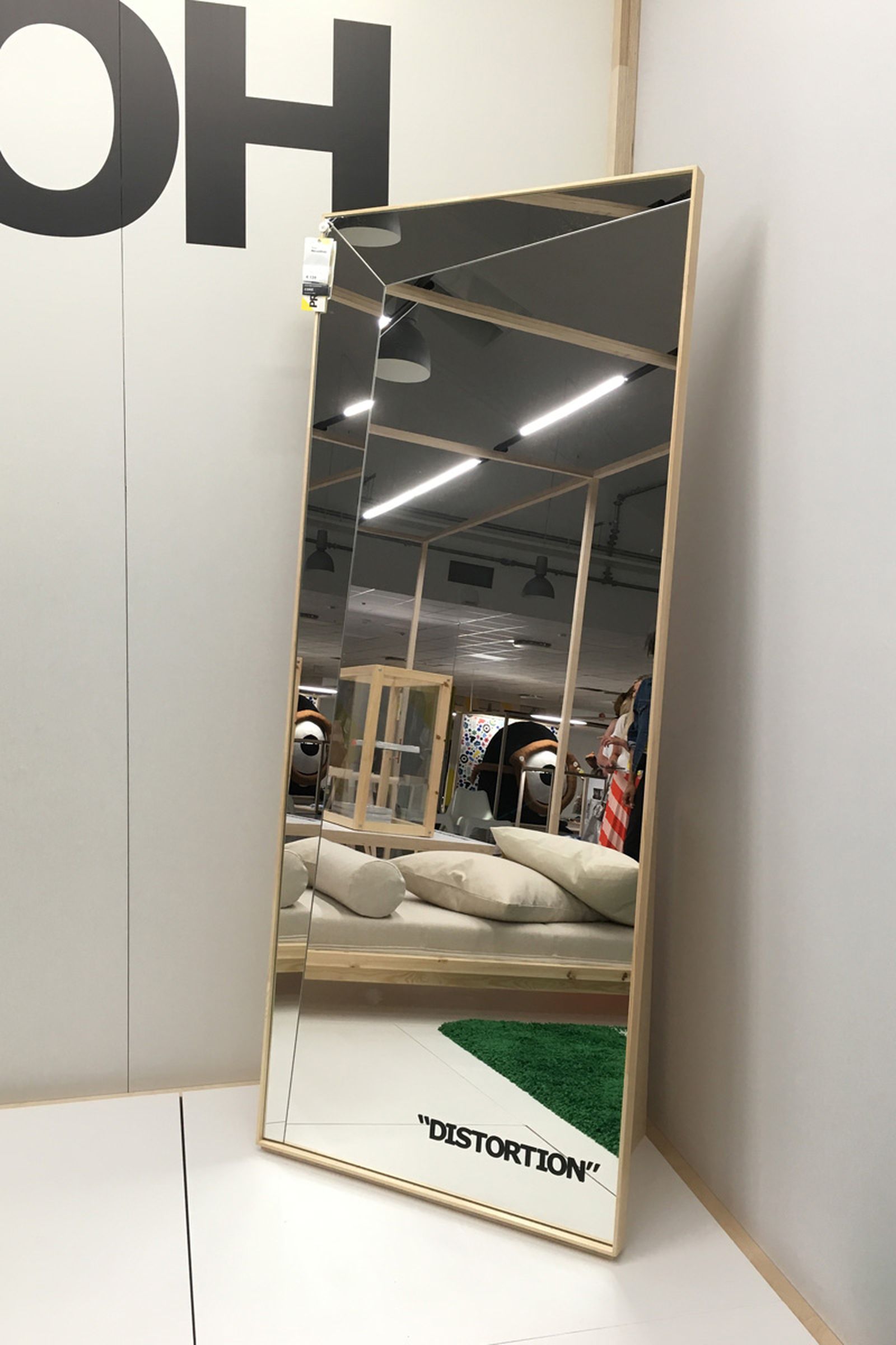
As for the mirror, it’s essentially broken, which in turn distorts a viewer’s reality. Another trick in Abloh’s toolbox. Some may see the chair, table and daybed and think that there hasn't been much thought put into their design. They appear to be the same as many other pieces under the respective category of furniture. But Virgil’s creative doorstop literally stopped him in motion. Why build another chair, do we need another table? When he started asking these questions the pieces started to design themselves, hence the generic nature. They were meant to feel familiar.
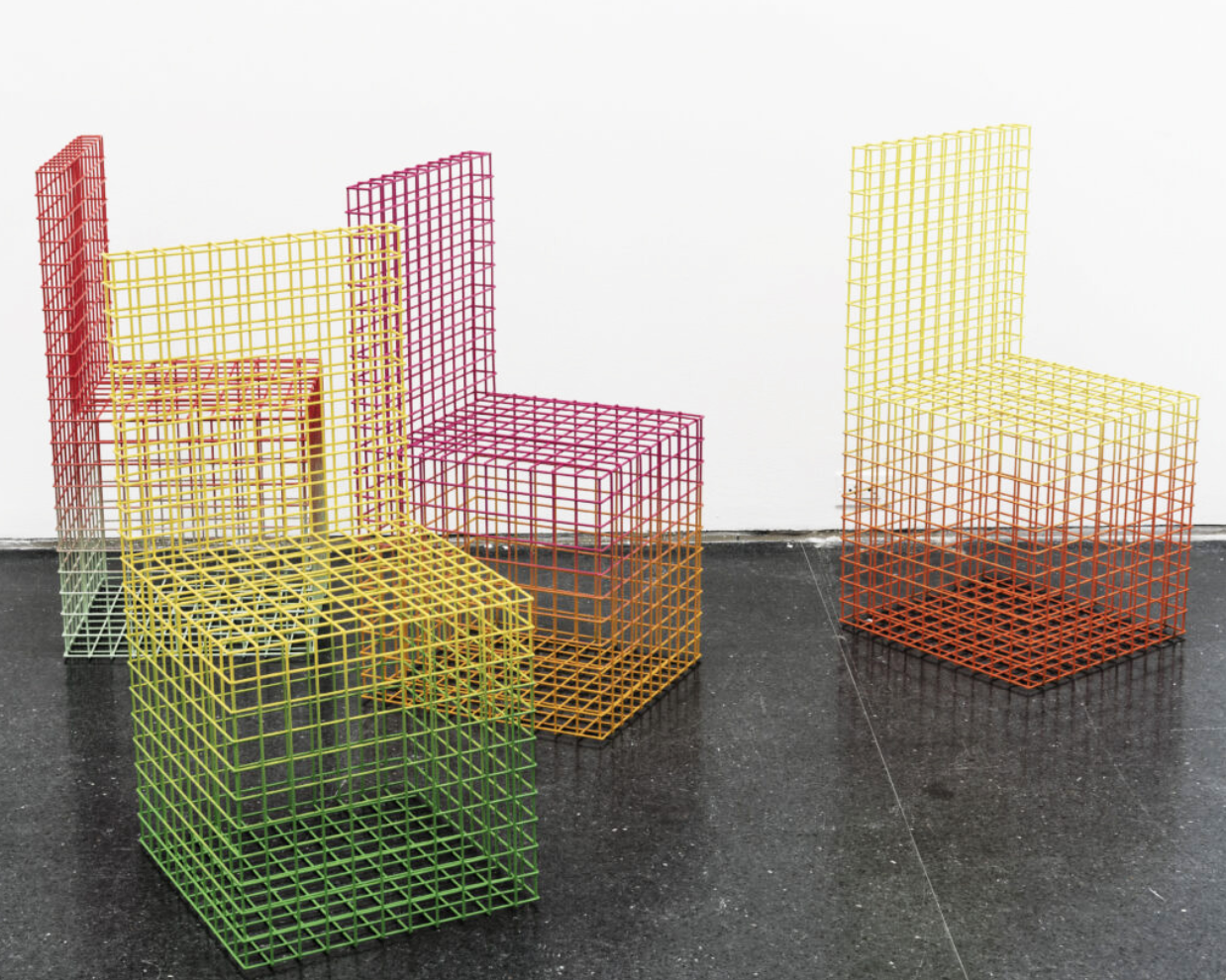
Later on, in 2017, he released his seminal “gradient furniture” table that flew heavily under the radar. The table taking heavy inspiration from “framing” however featured a coloured grid with a gradient, powder-coated finish. This project would emerge later on in 2019, in the form of chairs.
In 2019 Abloh linked up with Carpenters Workshop Gallery for his “Acqua Alta” furniture project, part of the “dysfunctional” exhibition that was shown in Venice. The name translates to “high water”, a term used in Venice to describe the periodically high tide peaks in the northern Adriatic Sea which cause annual flooding. The title thus invokes thoughts of climate change and how rising tides impact communities. Abloh told this story using three pieces of furniture - a chair, bench and floor lamp.
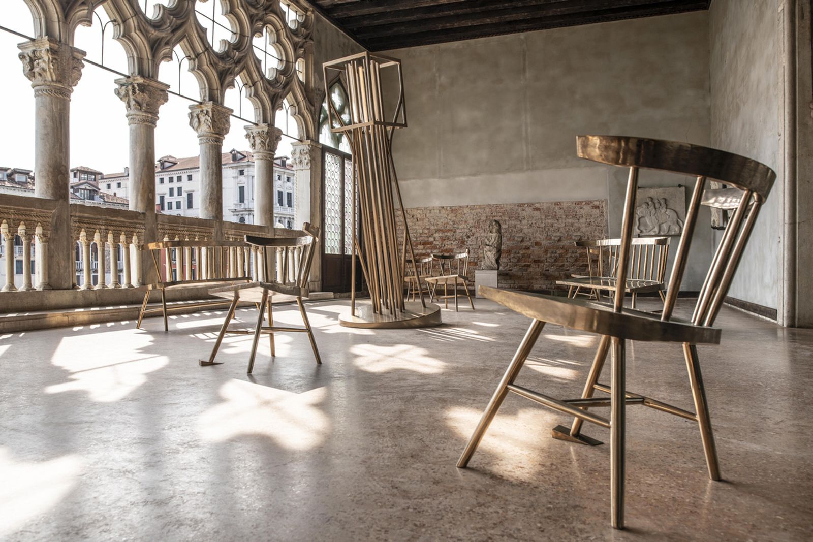
Both the chair and bench are identical to the IKEA chair, with the bench being a longer version to accommodate more people. All three pieces are made of Bronze and are designed to be slightly lopsided, as if lifted by a rising tide (or perhaps would sit level with the tides help?). Virgil’s rationale for keeping them the same goes back to the question he posed at IKEA: do we need another chair? Going back to the 3% rule, only modifying a piece three percent from its original form in order to keep the familiarity of the old object, but with a slightly different story being told.
The re-interpretation of older ideas is just as important as creating something new. Rephrasing the past in a different context can be a valuable tool to help society understand what was trying to be said back then, and Virgil uses that tool very well.
2019 was the year of the re-entry of “gradient furniture”, this time in the form of chairs that could be purchased on the Canary-Yellow art store. They can be seen in action at the Louis Vuitton atelier in Paris, where they certainly stand separate from most pieces in the space. This is a big deal, Their simplistic form accentuates the functionality of the grid, only using as much material as necessary. Each piece is custom made to order which provides a unique feel to each chair, slight differences can be noticed from one chair to another, making the experience of owning one feel much more personal. It is quite ironic that the product manual page on the website specifically states that the “chair” is not intended for use as home goods or seating. Strictly to serve as a commissioned piece of art.
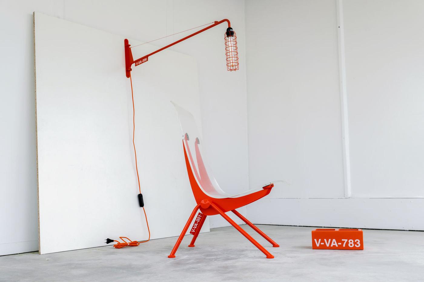
Imagining new landscapes to play on is the name of the game with Virgil, and that was exactly the intention during his project with Swiss-based furniture company Vitra. The collaboration took place in 2019 under the title “TWENTYTHIRTYFIVE” and the underlying concept was to imagine what a home will look like in the year 2035. Examining and predicting how trends will change in young consumers’ tastes as they get older. Virgil’s design team Alaska-Alaska, which is composed of young designers and talent, quickly went to work alongside the man himself to conjure up an image that wasn’t too futuristic, yet stepped outside of what exists globally today.
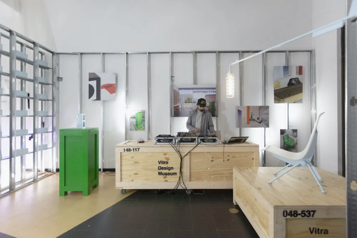
The collection consisted of a ceramic cinder block, a lamp and a chair, both the lamp and the chair were strongly based on Jean Prouvé’s Petit Potence wall lamp, as well as his Antony armchair. Virgil used his battle-tested 3% rule once again to pay homage to the great designer, but add his own aesthetic to the collection. The back of the chair was constructed from a piece of plexiglass while the lamp’s lightbulb was caged in by a metal grid, which provided a pleasant industrial feeling. Pulling from the past to tell a new story once again. All of the metal components of the collection were featured in a stark orange or light blue, possibly to draw your eye to the design differences and illustrate what the team thought made the designs more futuristic.
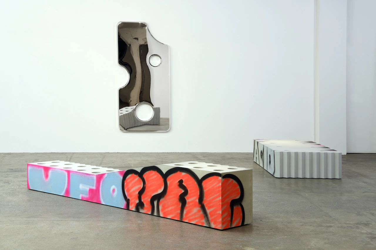
Paris-based art studio, Galerie Kreo featured twenty pieces of Abloh’s furniture at the start of 2020, and let me say it sure was a great start to the year. The collection was titled Efflorescence and consisted of furniture ranging from coffee tables to vases and chairs. Abloh took some hints from the brutalist nature of the New York streets he came to love through the lens of urban activities, many pieces painting pictures of a kid with the wrong skateboard size trying to learn a 50-50 on a curb. Of course, graffiti culture had to have a say in the finished product. Abloh imparted his hand style on many of the tables and chairs making them feel much more urban, and not meant to be housed in such a gallery.
Of course, not everyone has over a thousand dollars to spend on a piece of furniture, regardless of how much you appreciate the design or how coveted you think it may be. Design has to come full circle, and while it can exist in exclusive galleries and limited collections, it has less democratic validity if it does not come back to the masses in some way or another.
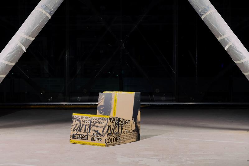
Virgil’s most recent furniture venture came, again, from his studio Alaska-Alaska, and consisted of a cardboard seating option, engulfed in graphics, that once again is classified as an art object, and not recommended as seating. The idea is that you build it yourself, piece by piece, and then use the included role of branded tape to seal the seams and hold your newly created “chair” together. The chairs are limited to twenty-five of each style and are still in stock surprisingly. The abundant and cheap nature of the material makes it feel like you can build one of these yourself. It almost feels that this type of experimentation Alaska-Alaska is doing is purely to inspire others to build their own version of this chair.
Designer is arguably the most accurate title for Virgil, however by not subscribing to a single label, he’s made himself one of the most talked-about creatives on the planet. Furniture isn’t even scratching the surface of a catalogue that will long outlive Virgil himself.